
Checklist
Renders acceptance criteria, inspection records, and release tasks with GitHub-style graphic checkboxes by default. Items remain in input order.
Import
import { checklistPlugin, type ChecklistItem, type ChecklistOptions } from 'docx-kit'The standalone package exports the same factory and types from @docxkit/plugin-checklist.
Options
| Option | Type | Default | Description |
|---|---|---|---|
items | ChecklistItem[] | Required | Ordered tasks; an empty array renders (no items) |
checkboxStyle | 'github' | 'native' | 'github' | Static rounded graphics, or native Word controls that can be toggled |
title | string | — | Optional checklist heading |
ChecklistItem
| Field | Type | Default | Description |
|---|---|---|---|
text | string | Required | Task label and checkbox alias |
checked | boolean | false | Initial checked state |
group | string | — | Heading emitted when the group changes |
owner | string | — | Responsible person, after the task label |
note | string | — | Indented note below the task |
Adjacent items with the same group share one heading. A group that reappears later gets a new heading; items are never sorted or regrouped. Ungrouped items reset the current group. Group headings are bold, use the theme's accent color (falling back to primary), and scale to approximately 120% of the task font size. The optional checklist title uses primary at approximately 140%, preserving a clear hierarchy above the groups. Explicit invocation colors override these defaults.
Complete example
Open this example in the Playground to edit the code, preview it, or download the DOCX.
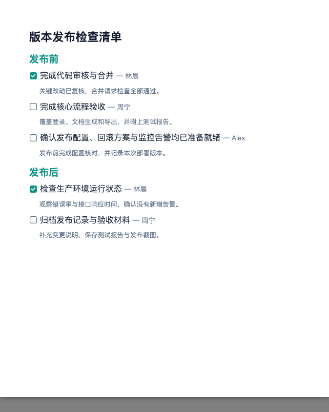
This Ocean theme sample includes both groups, owners, notes, and checked and unchecked tasks. Body text is 12pt, group headings are 14.5pt, owners are 10pt, and notes are 9.5pt.
import { checklistPlugin, createDocx, useTheme } from 'docx-kit'

const doc = createDocx({
  theme: useTheme('ocean'),
  page: { size: { width: '170mm', height: '205mm' }, margin: '15mm' },
})
  .use(checklistPlugin())
  .add({
    type: 'plugin',
    name: 'checklist',
    style: { fontSize: 12 },
    options: {
      title: '版本发布检查清单',
      items: [
        {
          group: '发布前',
          text: '完成代码审核与合并',
          checked: true,
          owner: '林晨',
          note: '关键改动已复核,合并请求检查全部通过。',
        },
        {
          group: '发布前',
          text: '完成核心流程验收',
          owner: '周宁',
          note: '覆盖登录、文档生成和导出,并附上测试报告。',
        },
        {
          group: '发布前',
          text: '确认发布配置、回滚方案与监控告警均已准备就绪',
          owner: 'Alex',
          note: '发布前完成配置核对,并记录本次部署版本。',
        },
        {
          group: '发布后',
          text: '检查生产环境运行状态',
          checked: true,
          owner: '林晨',
          note: '观察错误率与接口响应时间,确认没有新增告警。',
        },
        {
          group: '发布后',
          text: '归档发布记录与验收材料',
          owner: '周宁',
          note: '补充变更说明,保存测试报告与发布截图。',
        },
      ],
    },
  })

doc.toBlob()
The default 'github' style uses SVG graphics with high-resolution PNG fallbacks. Checked boxes use the theme's accent color (falling back to primary) with a white check. Unchecked outlines use muted (falling back to border), and their fill uses background. Both image formats follow the same theme colors. Graphic checkboxes scale with the task's effective font size and align with the text's visual center; wrapped text and notes share the same text inset. These are static images and do not depend on symbol fonts.
Set checkboxStyle: 'native' to use Word checkbox content controls that can be toggled in supported readers. Browser previews may display only their initial state. Notes and owners use the theme's muted color; invocation styles override default text and paragraph styling. Notes scale to approximately 80% of the task's effective font size, rounded to Word's half-point precision. Owner labels scale to approximately 85% and retain the theme's muted color even when task text has an explicit color override.
Style customization
Pass { styles } to the factory for instance defaults, and options.styles for invocation overrides. The package and docx-kit entry points export ChecklistConfig and ChecklistStyles. Priority: built-in/theme defaults → initialization styles → common node style → invocation part styles. Nested fields merge; arrays replace; undefined retains defaults; 0 and false apply. Units and theme tokens such as $colors.primary are supported.
| Parts | Style type | Scope |
|---|---|---|
emptyText, group, item, note, owner, title | TextStyleRule | Run typography |
emptyParagraph, groupParagraph, itemParagraph, noteParagraph, titleParagraph | ParagraphStyleRule | Background, borders, alignment, spacing and flow |
Common body font sizes retain the existing title/group/owner/note proportions. An explicit size on a part overrides that scaling. item.fontSize also scales graphic checkboxes and task indentation. Owner colors now follow the common style cascade.
checklistPlugin({
  styles: { title: { color: '#2563EB', fontSize: 14 } },
})
Use the same part names in options.styles for a single call. JSON DSL, AI tool schemas and MCP validation share these contracts; unknown parts and misplaced properties are rejected.
Inherited font sizes and part sizes both support all length-token categories, including $spacing.body as well as $fontSize.base.